Squeeze Logo Redesign
EVEN MARKETING AGENCIES NEED A NEW LOGO SOMETIMES!
In late 2022, it became apparent that Squeeze needed a new logo. Our original logo was awesome and served its purpose, but the time for change had come. It no longer reflected our cutting-edge design capabilities, strategies, and forward-thinking culture. In short, we had taken our business to the next level, and our existing brand no longer matched.
The logo sets the tone for the rebrand, and our goal was to create a bold, eye-catching, fresh visual identity that better represents what we had become. It needed to resonate with our tech-savvy, progressive clientele while standing out in the competitive digital marketing landscape.
When you’re a marketing company making your own logo you can’t miss.

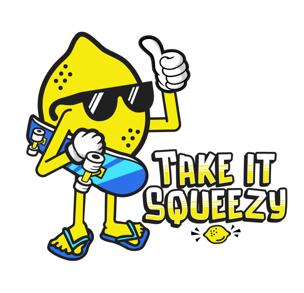
Our Original Logo
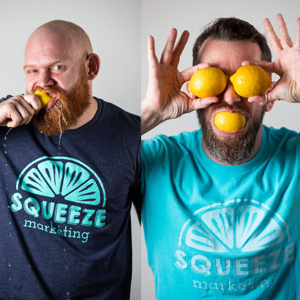
With our original logo, we made lots of fun memories (and even more merch!). During this time, we also created a ton of fun lemon characters and mascots, which ended up on promotional products and got our name out around town. We had to keep the fun for the new identity but inject more refinement and professionalism.
We knew we needed a new logo, but first, we had to find the direction. To get things going, we became our own client and started meeting frequently.
We knew we needed a new logo, but first, we had to find the direction. To get things going, we became our own client and started meeting frequently.
The Beginning of Something Great
The First Draft
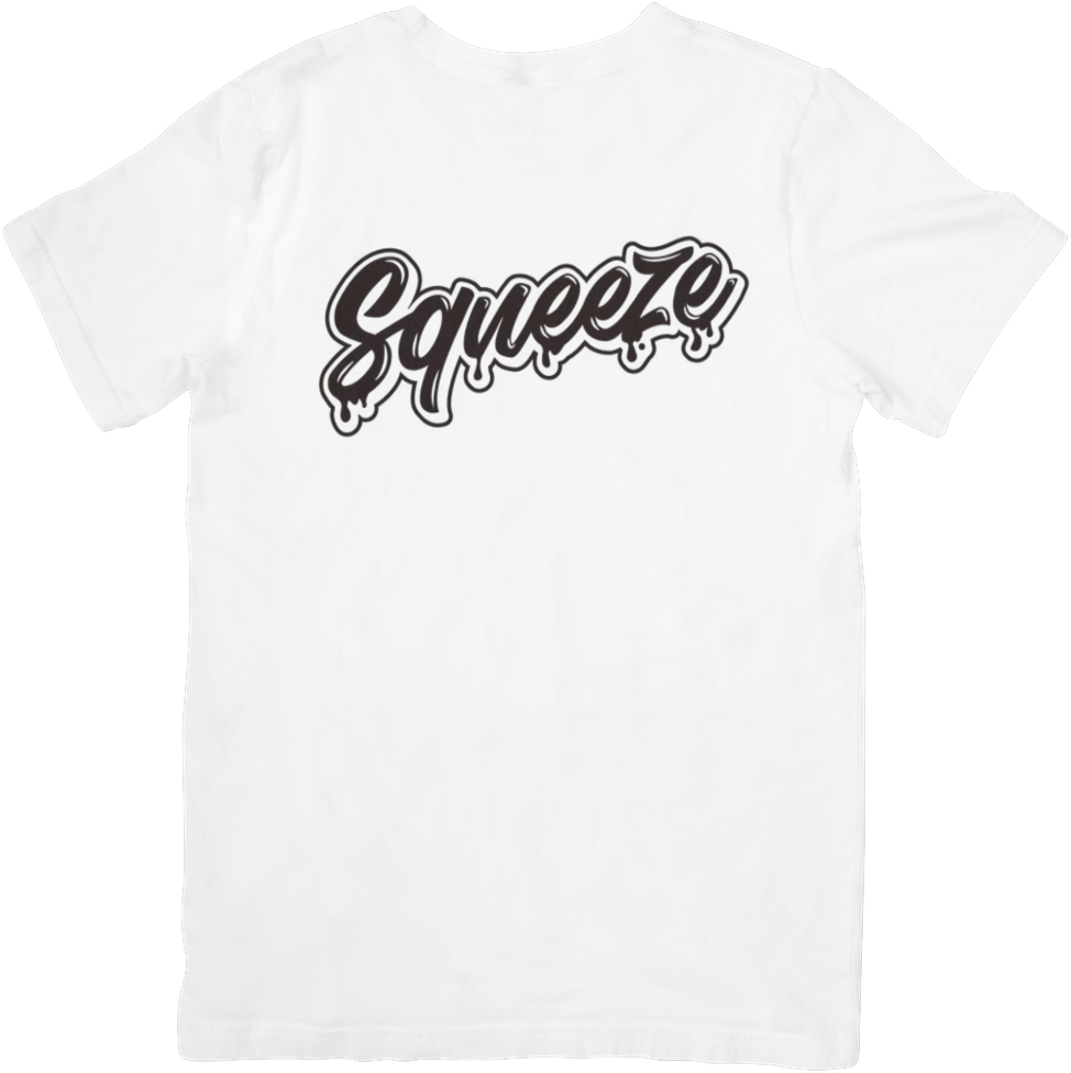
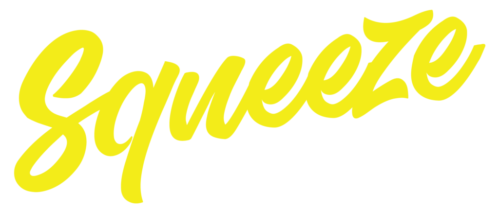
To start, we found a script typeface that we liked as the base for the logo and set “Squeeze” in it. Everyone thought it looked good and had potential, so we printed it on some t-shirts and sweatshirts to test it. The shirts became an instant hit, so we knew we had something. We found our direction! From there, we decided on our goals for the logo and turned it from a rough vision into reality.
A Fine Time for Refinement
Add Drips
Add Depth
Add Highlights
At this point, we had the beginnings of a logo but had yet to get to the devilish part of adding the details:
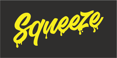
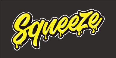
- We started by altering some letters and fixing issues we noticed on the shirt. Then, we added drips to communicate Squeeze, like the word had been squeezed visually.
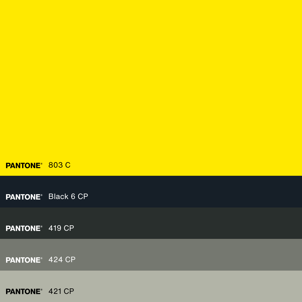
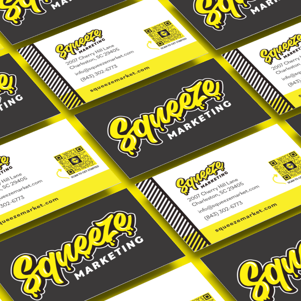
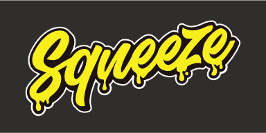
- As you can see above, yellow doesn’t stand out well on a white background, so we set the logo on a black background to give it contrast and depth. After that, we added a white outline so it would pop on a black background and still read well in any color other than yellow.
- We added highlights to add even more dimension and depth.
At last! Our logo was finished...
Our logo is active and impactful. Playful, yet focused and refined. It represents our culture and approach to marketing.
Logo
Wordmarketing
Wordmark
